
juni
모달, 토글 ( react-dialog, react-switch ), 조건부 랜더링 ( 등급별 ) 본문
Dialog와 Switch를 활용하여 권한 설정 퍼블리싱, API완성 전이라 로컬에서 임시 구현
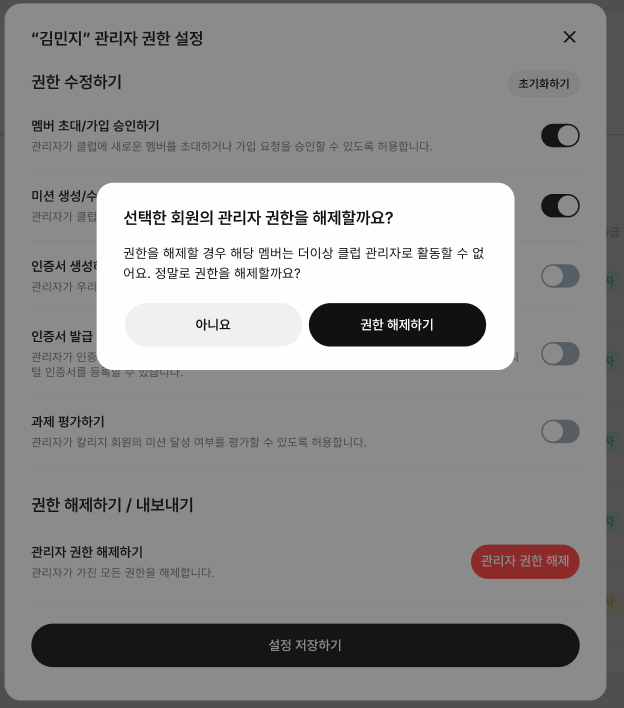
Dialog 예시
import * as DialogPrimitive from "@radix-ui/react-dialog";
import * as React from "react";

import { cn } from "@/lib/utils";
import { cva } from "class-variance-authority";

const DialogTrigger = DialogPrimitive.Trigger;

const DialogPortal = DialogPrimitive.Portal;

const DialogClose = DialogPrimitive.Close;

const DialogOverlay = React.forwardRef<
  React.ElementRef<typeof DialogPrimitive.Overlay>,
  React.ComponentPropsWithoutRef<typeof DialogPrimitive.Overlay>
>(({ className, ...props }, ref) => (
  <DialogPrimitive.Overlay
    ref={ref}
    className={cn(
      "fixed inset-0 z-50 bg-[#000000]/30 backdrop-blur-sm data-[state=open]:animate-in data-[state=closed]:animate-out data-[state=closed]:fade-out-0 data-[state=open]:fade-in-0",
      className
    )}
    {...props}
  />
));
DialogOverlay.displayName = DialogPrimitive.Overlay.displayName;

switch 예시
import * as SwitchPrimitives from "@radix-ui/react-switch"
import * as React from "react"

import { cn } from "@/lib/utils"

const Switch = React.forwardRef<
  React.ElementRef<typeof SwitchPrimitives.Root>,
  React.ComponentPropsWithoutRef<typeof SwitchPrimitives.Root>
>(({ className, ...props }, ref) => (
    <SwitchPrimitives.Root
      className={cn(
        "flex items-center h-7 w-[46px] shrink-0 cursor-pointer rounded-full transition-all",
        "data-[disabled]:bg-background-layer-2 disabled:cursor-not-allowed bg-accent-primary data-[state=unchecked]:bg-icon-secondary p-0.5"
      )}
      {...props}
      ref={ref}
    >
      <SwitchPrimitives.Thumb
        className={cn(
          "pointer-events-none block h-6 w-6 shadow-switch rounded-full ring-0 transition-all",
          "data-[state=checked]:translate-x-[18px] bg-background-layer-1 data-[disabled]:bg-border-input"
        )}
      />
    </SwitchPrimitives.Root>
))
Switch.displayName = SwitchPrimitives.Root.displayName
회원 등급 별 뱃지 디자인 적용

뱃지 커스텀 UI 에 적용 예시
  const memberRole = (role: string, status: string) => {
    // role 은 admin, member, owner
    // status 는 소속, 가입요청, 초대
    // 소속, 가입요청, 초대는 member로 출력되는 상태

    if (role === "admin") {
      return { text: "운영자", variant: "yellow" };
    }
    if (role === "owner") {
      return { text: "관리자", variant: "success" };
    }
    if (role === "member" && status === "소속") {
      return { text: "정회원", variant: "info" };
    }
    if (role === "member" && status === "가입요청") {
      return { text: "가입대기중", variant: "warning" };
    }
    if (role === "member" && status === "초대") {
      return { text: "초대중", variant: "purple" };
    }
    return { text: "-", variant: "default" };
  };

  const { text, variant } = memberRole(item.role, item.status) as {
    text: string;
    variant: "default" | "warning" | "success" | "info" | "purple" | "yellow";
  };

        return (
        <Badge variant={variant} shape="md">
          {text}
        </Badge>
        )
'인턴' 카테고리의 다른 글
| 커뮤니티 (게시글 고정) API 연동 (2) | 2024.11.13 |
|---|---|
| 게시글 고정 (1) | 2024.11.13 |
| 프로필 아바타 및 이미지 수정 (1) | 2024.11.12 |
| 게시글 삭제, 상세 게시글 DropDownMenu 연결 (0) | 2024.11.12 |
| 게시글 생성/수정 ( defaultValues로 관리 ) (1) | 2024.11.12 |
'인턴' Related Articles
more


